6 Email Template Design Tips You Should Always Follow
More than 260 billion emails are sent around the world every single day.
So how do you make sure your messages stand out in a subscriber’s inbox? Well, great content, for one. But another extremely important factor: email design. Eye-catching emails that effectively communicate your message will improve metrics like open rates, click through rates, and conversions.
Luckily, email templates are an easy and time-efficient way to create beautifully branded messages. Most Email Service Providers have some to choose from. In fact, AWeber has more than 700 templates in our platform.
(Not an AWeber customer yet? Sign up for your free trial today!)
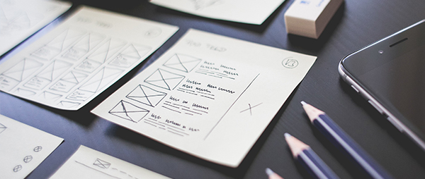
Before you start dragging and dropping your content into a template, though, there are a few design tips you should know. Follow these six simple tricks to get the most out of every template.
Pick the right template for the job
Do you want to welcome a new reader? Update them on a new product? Announce a huge sale? With hundreds of templates to choose from, you want to pick a design that best suits your goal.
(Want a more customized template that perfectly matches your website or brand? Click here to work one-on-one with an AWeber designer to create one.)
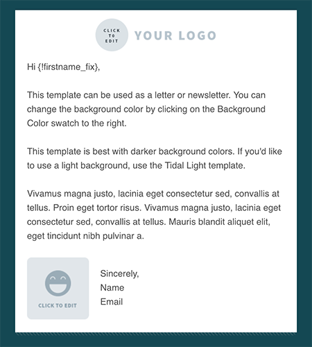
For instance, if you’re an AWeber customer who wants to send a welcome letter to new subscribers, you may choose the “tidal” template (shown below). Then just add in your own text, logo, and personalization.
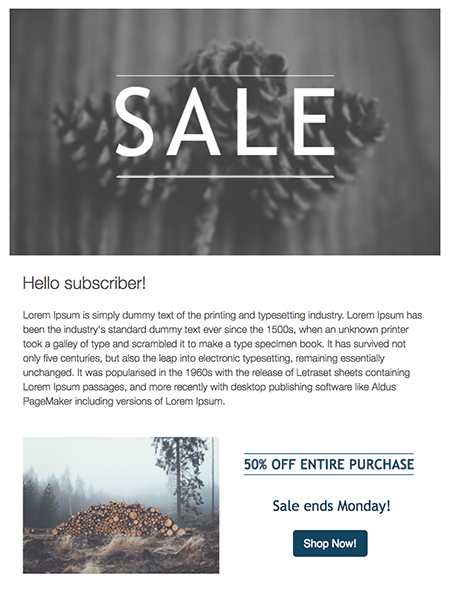
If you want to get your subscribers excited about an upcoming sale, catch their attention right away. Then lead them right to your discount, coupon, or offer. Here’s a simple, but effective design you might pick:
Keep your design clean and focused
Choice is the enemy of conversion. If you give a person too many options, it makes it difficult for them to make a final decision, according to psychologist Barry Schwartz, who named this phenomenon “the paradox of choice.”
Keep this in mind as you choose or tweak an email template. The design should be a path that leads the reader toward your ultimate goal. Add in too many other routes, and your reader may never get where you want them to go.
To give you an idea, here is an example from Moo, a custom print and design company. It’s a clean and focused email design that effectively promotes products. As a reader, you know exactly what the email’s goal is — to make you want to buy something!
![]()
We love this design because it:
- Follows a simple “Z” pattern layout, which means it easily moves your eyes in a zigzag that alternates text and images.
- Consists of minimal elements and concise writing for a streamlined look.
- Includes visual examples of each product to minimize the use of long chunks of text and to show off their array of products.
- Creates defined sections for each product with the use of thin dividers.
- Contains lots of white (or in this case, blue) space to draw your attention to the images.
- Incorporates large “call to action” product buttons (i.e.: Shop Postcards) for easy navigation to their website.
Create an eye-catching header
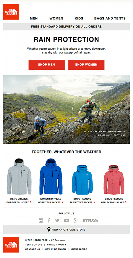
While you want your email template to reflect your brand, you don’t need it to look exactly like your website. You want to draw your reader’s attention to the important elements within your email — not overwhelm them with something that looks like a site.
Forgo a heavy navigation bar at the top for something more user-friendly like the North Face did below. It still drives subscribers back to their site, but it limits the number of choices and keeps things clean.
If your email can serve its purpose without the navigation bar, then take it out like this Burberry email below.
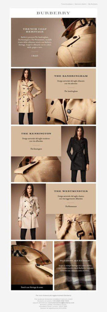
The goal of this email is to advertise their trench coat line and the design visually showcases this very well and plays up their brand. With the multi-tan color palette, you instantly know that it’s Burberry. The well-structured grid layout makes for a seamless flow of design as well. If the header was filled with navigational tools, it would diminish the overall feel of the brand and the message they are trying to send.
Balance your text-to-image ratio
When choosing or changing a template, keep your text-to-image ratio in mind. Text-to-image ratio is how much text there is in comparison to images in your email.
There’s no such thing as the perfect “text-to-image ratio”, but most people stick with 60 percent text and 40 percent images.
Here’s why it’s important not to rely too heavily on images:
- “Image-only” emails risk going to the SPAM folder since email service providers like Gmail, Yahoo! and Hotmail tend to filter and block them.
- Images may be ‘turned off’ as default by viewers or by their email client.
- Images can take longer than text to load based on browser and internet connection. A subscriber may leave the email before they’ve seen all the content.
Utilize alt text for images
When you include images in your messages, they may or may not always display in the email clients they were sent to. That’s because many email services will disable images in messages that are sent to their users, unless the user actually verifies that they do indeed want to see the images.
Alternative text is helpful in these cases. When an image doesn’t load, a line of text will appear that describes what should be there.
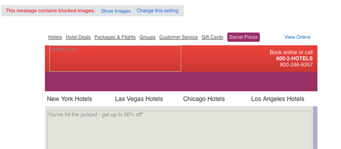
Take a look at this email from Hotels.com where images were blocked, but the use of alt text was implemented.
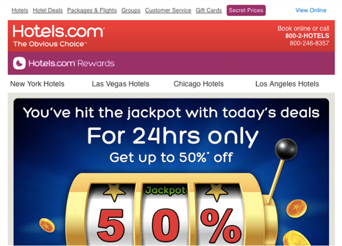
And here’s what it should actually look like:
Now, you may be wondering, “Is including alt text worth my time?”
Absolutely. Forty-eight percent of mobile clients will block images by default, according to the email testing platform called Litmus. If you set up alt text, the description will appear where the images were supposed to go. If you don’t, your reader will only see blank boxes.
Alt text is also important for your subscribers with visual or certain cognitive disabilities. They may have a screen reader that will read the alt text to them so they get a full understanding of what’s included in your message.
If you are using AWeber’s Drag & Drop editor, click here to see how to set up alt text for your images.
Pro Tip: Not all images need alt text. If your image is purely for the aesthetics of the email, be sure to set an empty alt text value for the image.
Test your message
Mistakes can make you look unprofessional and sloppy. One bad experience may be enough to turn a subscriber away for good.
So test your emails! It only takes an extra minute or two, but the payoff is huge. We even recommend sending the test email to a couple people you trust and who aren’t afraid to give you an honest critique. They offer a fresh pair of eyes that may catch something you didn’t.
You should also send the test to accounts in different email services like Gmail, Yahoo! or Outlook. Here at AWeber, each of our marketing specialists has about three to five different test email accounts so they can review our messages and templates in multiple platforms before we hit the send button.
And always test on different devices — desktop, tablet, and mobile — if possible. Sometimes an email template you selected on desktop may have formatting issues on a cell phone. AWeber’s email templates are all mobile-responsive, but we can’t vouch for all other ESPs, so test just to make sure.
If you’re using AWeber: To easily check emails before you send, click on the “Preview & Test” button on the upper right-hand side of your screen. Enter your email address and hit “Send Test” to get a test email delivered to your inbox.
If you’re not using AWeber: Check out email testing tools like Email on Acid or Litmus to preview your design before you send.
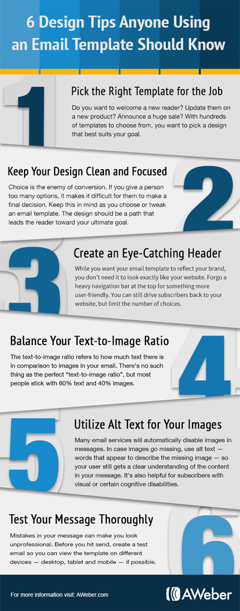
Your template design cheat sheet
Feel free to download this recap below for the next time you use an email template.
And if you’re looking for an email template that perfectly fits your style and brand, contact an AWeber designer today.
The post 6 Email Template Design Tips You Should Always Follow appeared first on Email Marketing Tips.