This Art Director Reviewed 50 of the Most Popular Emails. Here Are the Top Design Trends You Must Know
Email templates are great. They do most of the design work for you.
But there’s one problem with templates: Many are just plain boring. They’re like the monotone voice of your high school physics teacher. The content may be important, but you can’t help but snooze.
So I decided to take a look at the 50 most recent emails on Really Good Emails — a website that showcases the best email designs on the web — to find some of the top design trends in the industry right now.
And you know what I found? You don’t have to be a digital Picasso to create eye-catching emails. In fact, you can easily incorporate these trends into any template via a drag-and-drop editor like AWeber’s. Here’s how.
(Want an easy-to-use drag-and-drop editor? Try a free 30-day trial with AWeber. We’re constantly updating our message editor so it’s even more awesome and user-friendly.)
Email Design Trend #1: BIG Headlines
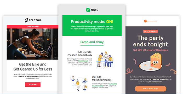
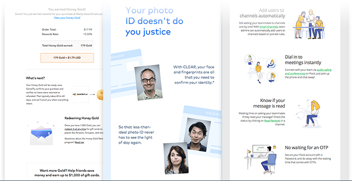
You may have the world’s best headline, but if it drowns in a sea of text, no one will notice it. That’s where “visual hierarchy” comes in. You want the most important information in your message to get noticed first.
Visual hierarchy can be achieved through color or placement or artwork, but in the examples above, you can see it’s done through a headline with an increased font size and bolded text. It makes the main message stand out right away.
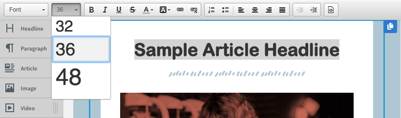
How to do this in AWeber: Using any of the AWeber templates, increase your headline font size in the text editing bar (pictured below). Most of the examples above are using font sizes of at least 36px. So don’t be afraid to size wayyyy up!
(Need a custom email template created that matches your brand’s style? AWeber’s design team can make it for you. Request a consultation today.)
Email Design Trend #2: Bold Header Images
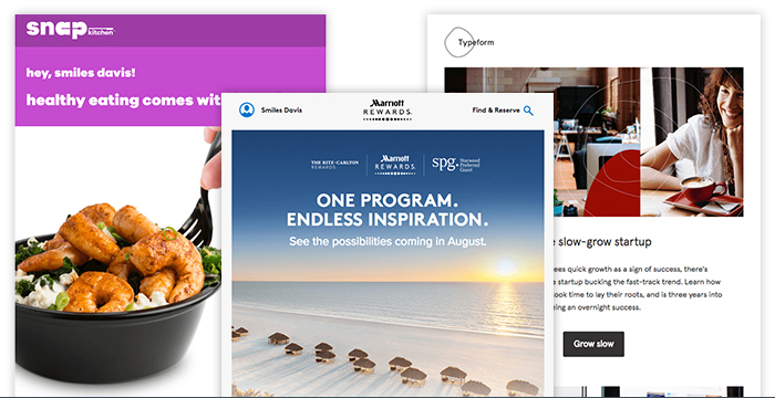
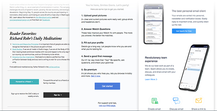
This trend goes hand-in-hand with big headlines, but it has a different design intent than just getting noticed: It evokes emotion.
With large header images, you’re attempting to make an emotional connection with the viewer in the first few seconds after they open your message. The image sets a mood (happy! sad! angry!) or conveys a state of mind (hunger! relaxation!).
Don’t have a big budget or an in-house photographer? Use a site like unsplash.com, where you can access royalty-free images.
Above are three drastically different emails that give each individual brand a unique feel, predominately through their use of photographic header images.
How to do this in AWeber: Use the Breve or Wane template to get started with a large header image.
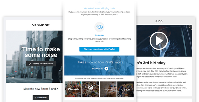
Email Design Trend #3: Zigzag Patterns
In an effort to break up chunks of text, many designers use a zigzag or “z” pattern. This design arrangement helps readers continue to move their way down an email, engaging with the imagery and content along the way. Think of it like a path for your reader to go down. It helps them make it to the end!
The zigzag pattern is also a nice way use imagery to convey your brand’s personality.
How to do this in AWeber: Use the Flat-white and Gibson templates, which have alternating sections built in.
Email Design Trend #4: Button and Link Balance
Want your readers to take an action, like clicking a link or replying to your email?
If everything in your message has equal importance, they won’t know where to focus their attention. Each element will scream for the reader to “look here!” And too many choices can kill conversion. Your reader will feel overwhelmed and won’t click anywhere.
Instead, use a mix of buttons and text links to call importance to the items you really want subscribers to focus on. Get your reader to take an action by pointing them to one button. It’s OK to add other hypertext links along the way, as long as your main call-to-action is most prominent. Here are a few examples of emails that do this well.
How to do this in AWeber: The drag-and-drop editor has a button element you can pull into your content. You can change its color and size, depending on how prominent you want to the call-to-action to be.
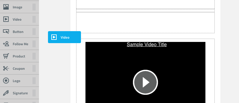
Email Design Trend #5: Videos
Wellllll kinda. You can’t include an actual video in emails yet, unfortunately. Most email clients — like Gmail and Outlook — won’t play video within a message, so you have to link to a hosted video outside of your email.
But one of the newest design trends is to include links to videos that also look like you could play them within the email. It’s a creative way to deliver motion pictures and get your readers to click and watch.
How to do this in AWeber: I recommend hosting your video on YouTube or Vimeo. Then, use the draggable video element that automatically overlays a play button on a freeze frame and links it out to the hosted version of your video.
Put It All Together
Spice up your go-to email template by incorporating one or two of these design trends into your next email.
Now that you have the design aspect covered, how is your content? Are you struggling with what to write in your emails? Then try our free email writing course. It comes with 45+ downloadable email templates to get you started.
And if you ever have a question or get stuck along the way, call, email, or chat AWeber’s Customer Solutions team. They’re available 24/7 — because email never sleeps.
Not an AWeber customer? Join our crew, and test out our industry-leading deliverability. Start your free 30-day trial today.
The post This Art Director Reviewed 50 of the Most Popular Emails. Here Are the Top Design Trends You Must Know appeared first on Email Marketing Tips.